This is a map outlining poverty in the Inland Northwest. This is from an article released from the New York Times with the information coming from the Census Bureau. I find this interesting because it is a good way of visually seeing "hot spots" for poverty in our area. Using this type of map can help to address what areas are in need of more services to help those in need.
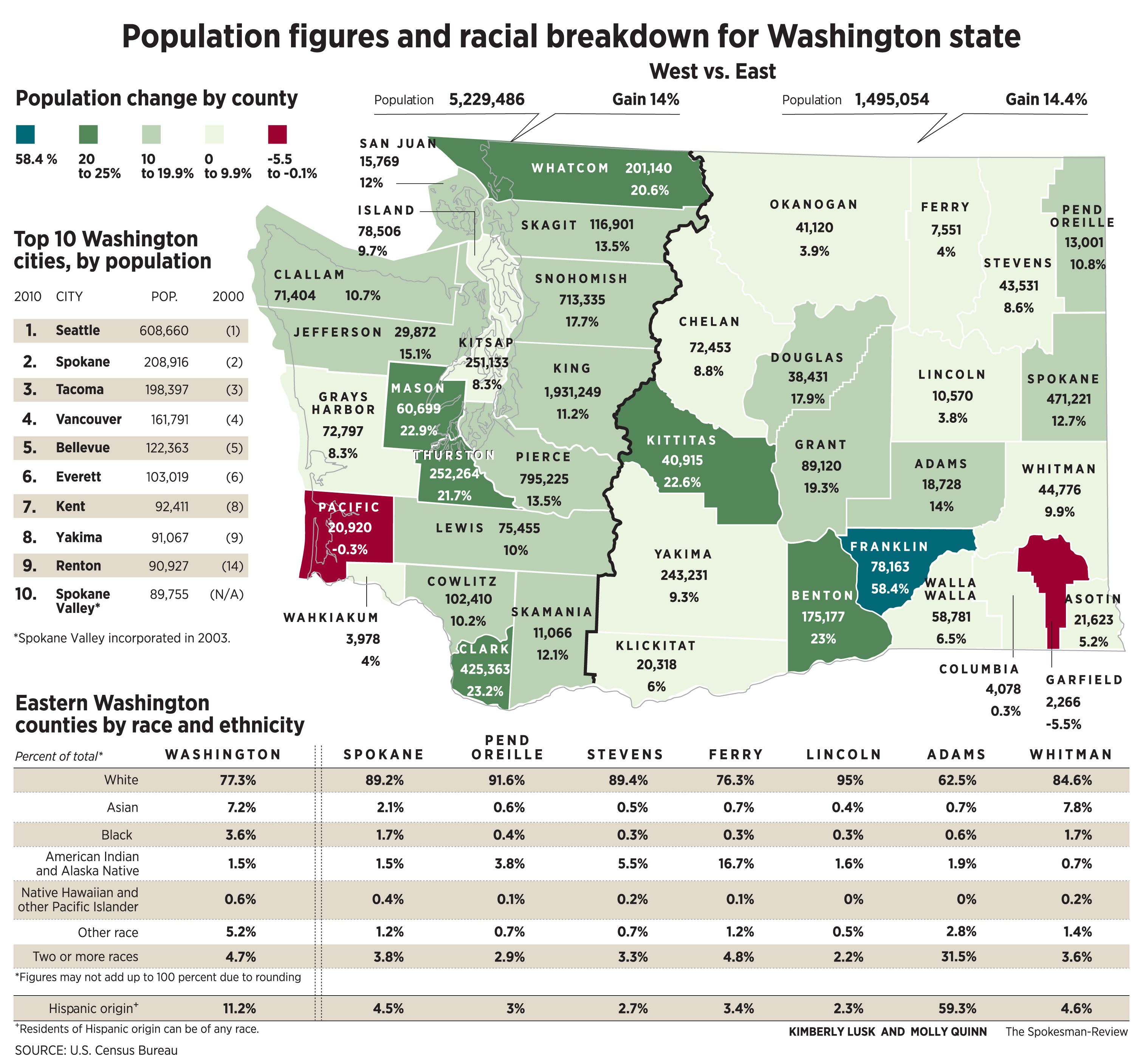
This map was published by the Spokesman Review and was created by the Census Bureau. This map outlines population differences throughout WA state and how different counties have grown in ethnicity. It is interesting to see migration patterns of different ethnicities and how they help diversify WA state.
The last map I found was released by the Uniform Crime Report and outlines the larceny rates for the US. I find this very interesting because WA state, specifically Spokane, has higher larceny rates than much of the country. Spokane is one of the highest cities in the country for car theft.

No comments:
Post a Comment